It can help to go back to basics.
It can help to go back to basics.
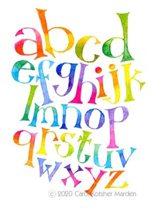
I’ve always loved how words fit together on a page and quietly, magically, bring worlds, portraits, ideas, and memories to life. It was probably inevitable that I’d fall in love with lettering; with fitting each “W,” “O,” “R,” and “D” together in an effort to make a picture worth a thousand words.
Here are a couple of recent lettering experiments in watercolor and colored pencil in — once again — my Stillman and Birn Beta series sketchbook. I’ve also been playing with Crowquill lettering in an Epsilon Series sketchbook, which has lighter paper. Hopefully I’ll have something to post from that, too, one of these days.

The Illustration Friday theme this week is “Hybrid.”

As I’m dreaming of the beach these days, I thought of some (un)common ocean hybrids. (The Chicken of the Sea, I should add, was named for her timid nature, and not for her resemblance to the bird!)
I took a leap and did this in my new Stillman and Birn Beta sketchbook, rather than my old favorite Canson Montval watercolor book. The Stillman and Birn Beta has 180 lb. paper, which is *lovely* — it holds watercolors nicely, is smooth enough for ink, and erases cleanly. Though Stillman and Birn sketchbooks are a bit pricey, I can see they’re worth it.
I’ve been playing around with calligraphy, and did the lettering for this with a Crow Quill pen and Rotring Artist Color ink. I’ve tried the Crow Quill on a *lot* of different papers, and it tends to catch on most of them. Can anyone suggest a good surface for Crow Quill work?
I thought of alligators first, but at the moment it’s my to-do list that’s closing in on me! I’m swamped.

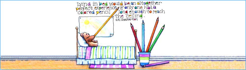
It’s been pouring here on and off, and I couldn’t resist this quote.

Hmmm. I was going to post something else for this Illustration Friday theme, but then this quote jumped out at me. So much for good intentions! The original’s about 7″ x 10″, and it’s once again watercolor and colored pencil on Canson Montval paper.

